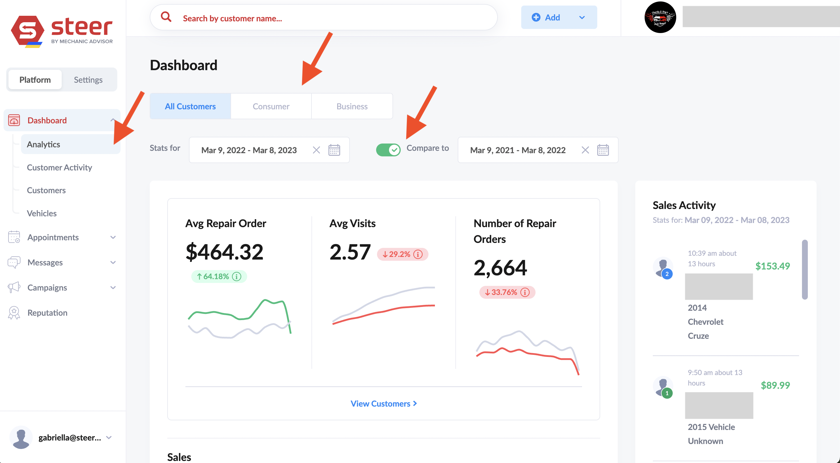
- Date Range
- You can customize the date range of the data appearing on the page.
- Data is compared to the data range of equal length just prior to the selected range
- Previous date range is in gray. Current date range is in red or green:
- Green means the metric is up compared to the previous date range
- Red means the metric is down compared to the previous date range
- You can toggle the comparison date range off so it does not appear on the graph.
- Previous date range is in gray. Current date range is in red or green:
-
Customer Type
- All Customers: “Consumer” and “Business”
- Consumer (Customers): Individual vehicle owners
- Business: Commercial or Fleet Accounts
- Sales Activity (far right)
- Shows the most recent invoices in the time frame selected.
- A green circle on the customer means they are a new customer with only 1 visit
- A blue circles on the customer means they are a returning customer with more than 1 visit
- View customers (link below the graphs)
- Takes you to a page with a list of the customers in date range list.